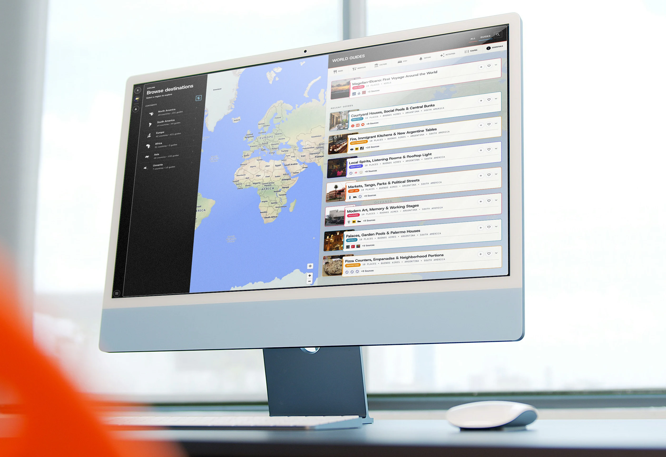
RGuide turns researched city knowledge into an interactive travel guide that helps people explore cities with confidence and make better decisions while they are there.
I designed and built the platform from the ground up. That meant shaping the experience on screen and the system behind it, so a useful idea could become a working product.
Define the problem
Put discovery on the map.
A good recommendation tells you why somewhere is worth visiting. A map tells you where it is. I wanted those two things to work together, from the first look at a city to the moment you choose a place.
The starting point
A list can make a city feel like a collection of unrelated stops. It leaves the traveler to work out what is nearby and how one place connects to the next.
With RGuide, I made geography part of the reading experience. The map gives each recommendation context, while the guide explains what makes it worth considering.
Design the experience
Keep the place in view.
The central decision was to let the guide and the map share the screen. People can compare recommendations, open a guide, and look at an individual stop while keeping a sense of the city around them.
From the interaction model to the finished interface
A familiar way to explore
I began with the relationship between the map and the guide, then worked through the details that make the interface consistent. The Barcelona views show how those decisions came together.
From the city to the detail
Keep the same sense of place- 01Choose a placeThe left side lets people move from a broad destination to a neighborhood.
- 02Keep your bearingsThe map stays visible while people compare places to visit.
- 03Narrow the choiceThe categories work the same way in every destination.
- 04Open what interests youEach card gives enough context to decide whether a guide is worth opening.
- 01Set expectationsThe title makes clear what the guide covers.
- 02Keep contextRelated guides stay close so there is always another way to explore.
- 03Explain the recommendationThe introduction explains the choice. Sources let people follow the research.
- 04Make it usableEach stop connects the recommendation to a place on the map.
- 1
- 2
- 3
- 4
- 5
- 6
Details that stay familiar
Consistency helps people find their wayThe finished interface
Barcelona, from browsing to choosingEvery view has an address
Opening a guide updates the URL. Someone can share that exact view and return to it without starting again.
The same journey, less space
On mobile, panels and sheets reorganize the content around the map. The relationship between a guide and its places stays the same.
Recognition before decoration
A category keeps its color from the guide card to the map marker. Repeated controls make familiar actions easier to find.
Design the content
One place. More than one story.
A restaurant might belong in several guides, each for a different reason. Its address and opening hours should stay consistent, while each guide can explain what makes it relevant.
Each guide carried its own facts
Local content objects let me build quickly. But the same venue appeared in multiple lists. A change in opening hours meant finding and updating every copy.
Give shared information one home
I separated the venue record from its place in a guide. The venue holds the facts. The guide holds the recommendation and the order of its stops.
The same restaurant can appear in a neighborhood walk and a guide to eating after midnight. Its hours come from one record. The reason to visit belongs to each guide.
Shared place records connect to individual guides. Prepared copies bring those relationships to the screen.
Filters that reflect the choice
Choosing a place to stay raises different questions from choosing a restaurant. I gave each category its own fields so the filters could reflect those differences.
For a stay, that might mean the type of lodging and its atmosphere. For a restaurant, it might mean the cuisine and when it serves food. The way the information is stored determines what the interface can help someone find.
Design the publishing process
Make good content repeatable.
As the catalog grew, writing a guide became only part of the work. I built a publishing process that connects the research to the right places and checks the result before it reaches the site. I applied the same checks when updating venue hours and preparing translations.
Start with a useful question and find sources that support the recommendations.
Connect each place to an existing venue record, or create one if it is new.
Write the guide and arrange its stops into a sequence that makes sense.
Add the supporting images and check the details someone will need to visit.
Prepare the guide for the interface and refresh the saved version.
Check the published page, including its sources and the places shown on the map.
Built to stay useful
A slow database should not leave someone with an empty guide. I built a fallback that can serve the last verified content while the live service recovers.
Show the latest guide
The page requests the published content for the place being viewed. Shared records are already assembled into a guide the interface can display.
Keep the guide available
A saved version keeps the essential guide and map available. Backup images help the page remain usable if an image service is interrupted.
Build for everyday use
Make the complexity earn its place.
The engineering decisions had to support the experience. I focused on loading what a person needs at that moment and keeping the guide useful as the amount of content grows.
A city page requests its own content. It does not need to fetch every guide in the catalog.
Neighborhood boundaries load as the traveler gets closer, keeping the first view lighter.
Saved versions bring related records together before the interface asks for them.
The media process creates smaller versions for cards, so a small image does not require a large download.
Inside the buildView the technical decisionsClose the technical decisions
01The interfaceNext.js
I used Next.js to connect page routes with the map experience. Selecting a guide updates the visible content and its address together. Local interface state keeps those interactions responsive.
02The recordsSupabase and PostGIS
Supabase stores the shared content in Postgres. PostGIS connects places to their coordinates and geographic boundaries. Access policies allow public reading while controlling who can make changes.
03The deliveryPrepared content
Database views assemble related records into the structure a guide needs. Versioned copies make those results reusable. Cloudflare R2 stores the images and their different sizes.
04The upkeepPublishing tools
I built scripts to handle recurring content work and verify the result. This made publishing easier to repeat as the number of destinations increased.
Room to develop
More ways into the same product
I treated growth as an extension of the core experience. Each addition needed to make the existing guide more useful.
Read in another language
Spanish content uses the same underlying records as English. Translations can develop without creating a separate product to maintain.
Find a guide through search
City and guide pages have their own addresses and readable content before the interactive map loads.
Come back to a place
Profiles and saved places give people a reason to return. The site can also be installed on a phone for easier access.
Support the service
Relevant stays can link to booking partners. Those links sit within the guide context without determining its editorial order.
Reflect on the result
An idea that became a working product.
The initial build ran from April to August 2026. Over 105 calendar days, I took RGuide from a map prototype to a published platform covering 47 cities.
Data driven exploration
Published guides now cover 78 cities. Behind each recommendation is a shared record that keeps its details connected to the wider guide.
I built the first explorer to test how a map and a guide could work together.
RGuide through search.
From August 20 to September 16, Google Search brought 356 clicks to RGuide, compared with 90 in the previous 28 days. The chart shows how that discovery developed over the full reporting period.
June 17 to September 16, 2026
- Google Search clicks
- 494
- Search impressions
- 237,348
Impressions count appearances in Google Search results. Clicks count interactions with those results, not unique visitors.
People began using it
The saved analytics show 7,912 pageviews and 1,115 unique visitors during the initial build. These figures describe early use, not whether every recommendation helped someone make a better decision.
April 27 to August 10, 2026
- Observed pageviews
- 7,912
- Unique visitors
- 1,115
The line shows cumulative pageviews. Unique visitors are reported separately for the same period.
What I took from the project
The experience depends on what sits behind it.
- Building RGuide made one thing clear to me: the interface cannot do its job alone.
- A filter is only useful if the information behind it supports the choice.
- A guide is only dependable if its details can be maintained.
The most valuable work was getting those decisions to support each other. It gave me a platform I could keep developing, with a clear relationship between what someone sees and how it is managed.
From the world to a street
The walkthrough follows one journey into Barcelona. Each step brings the choice closer without losing its place on the map.
World→Continent→Country→City→Neighborhood→Guide
-
01
Orient
World
Start with the places covered by the platform.
-
02
Focus
Europe
Choose a part of the world to explore.
-
03
Narrow
Spain
Find a city within the country.
-
04
Explore
Barcelona
See the city alongside its guides.
-
05
Understand
Neighborhoods
Look more closely at a neighborhood.
-
06
Act
Selected guide
Open a guide and follow its places on the map.