← Selected work Case study / Brand and digital designer

Branding

54 Hundred

I gave a Miami media studio a visual signature that could hold its own on a card, on screen, and across the city.

  • Branding
  • Art Direction
54 Hundred
Role

Brand and digital designer

Deliverables

Identity development · Business card concepts · Website concept · Outdoor concept

The assignment

The mark needed to introduce the studio without taking over the work it made.

54 Hundred brought video, photography, graphic design, and web work together under one Miami studio name. I developed an identity that could give those different services a common point of recognition while leaving room for each project to speak in its own voice.

Start with the name

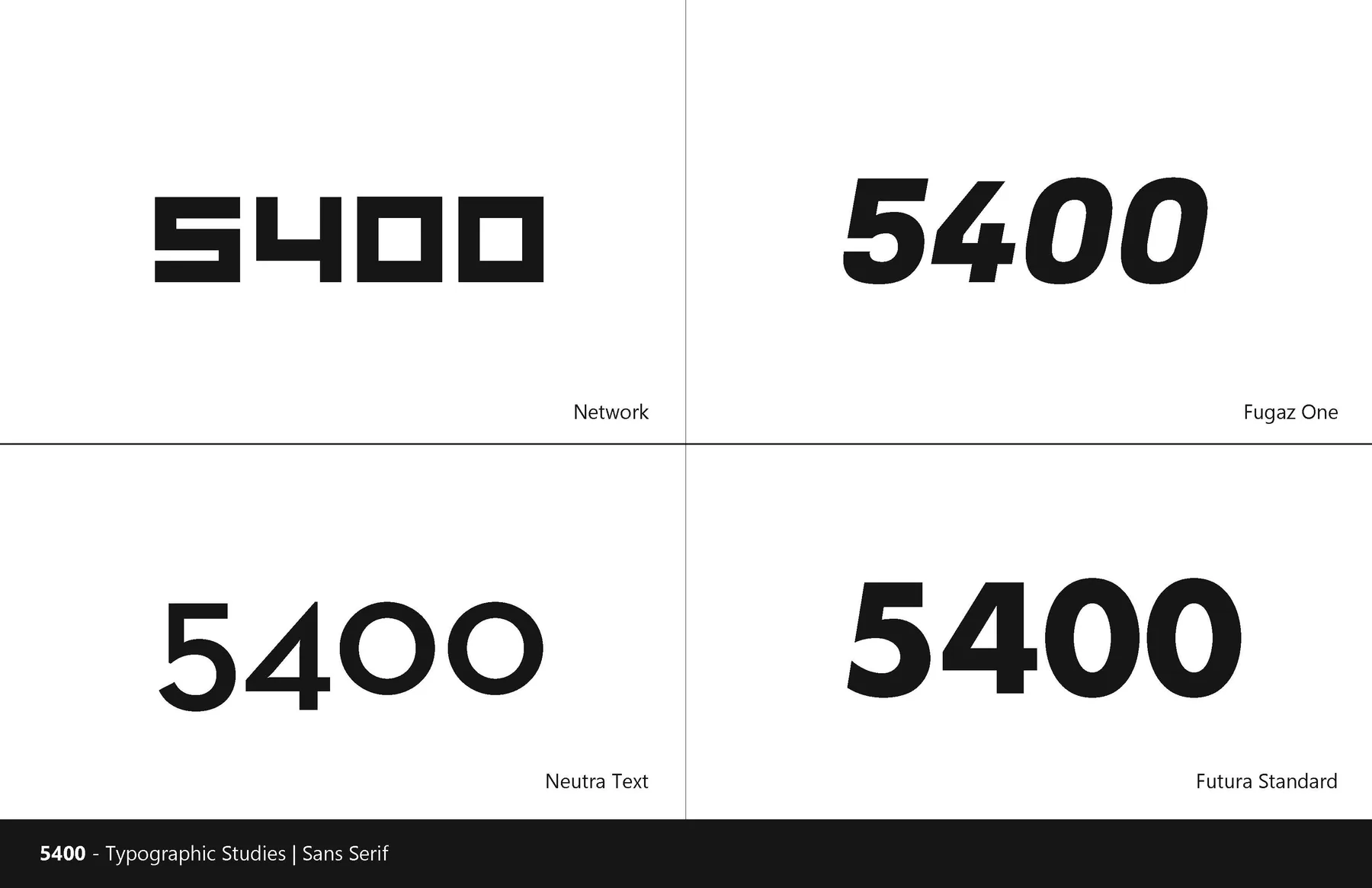
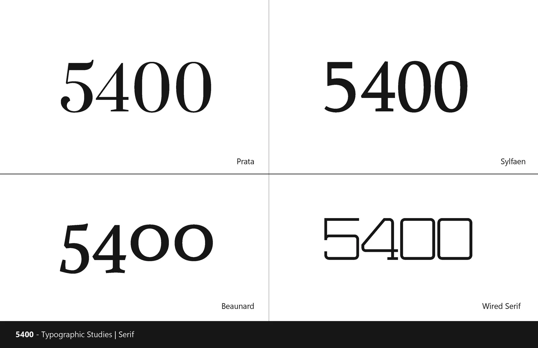
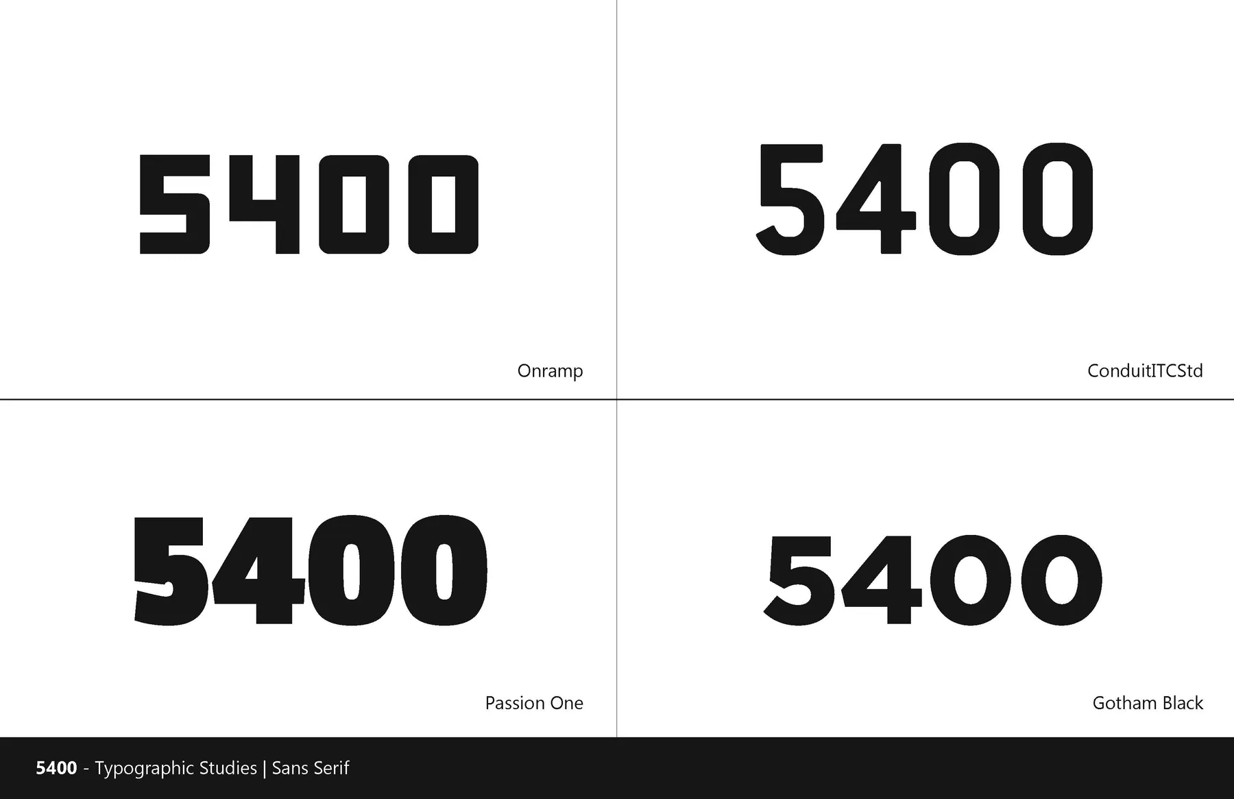
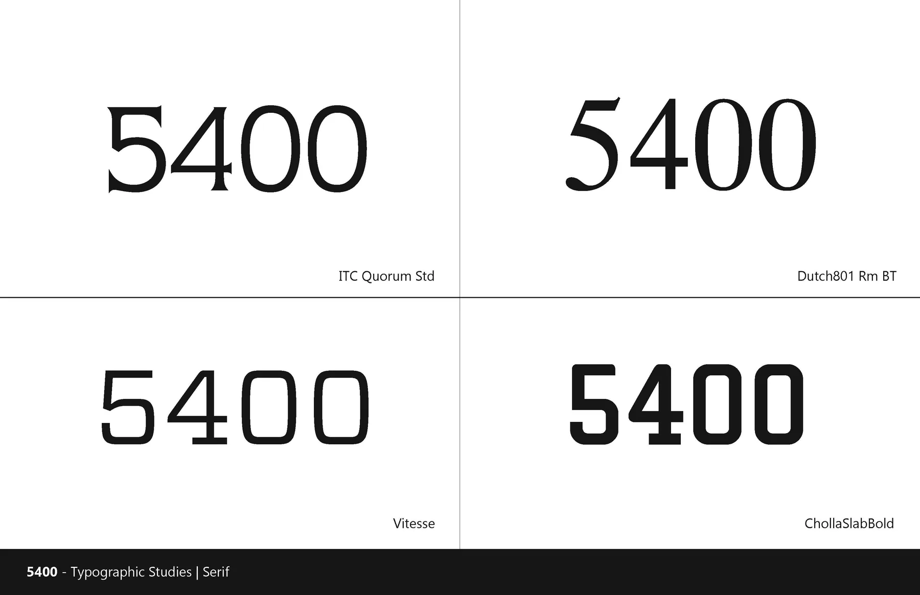
I looked at how other visual languages could suggest a studio with a home in Miami, then began setting 5400 in very different typefaces. Some read like technology. Others felt closer to an editorial title. Seeing them together made the tradeoff clearer: the studio needed character, but the name still had to be read at a glance.
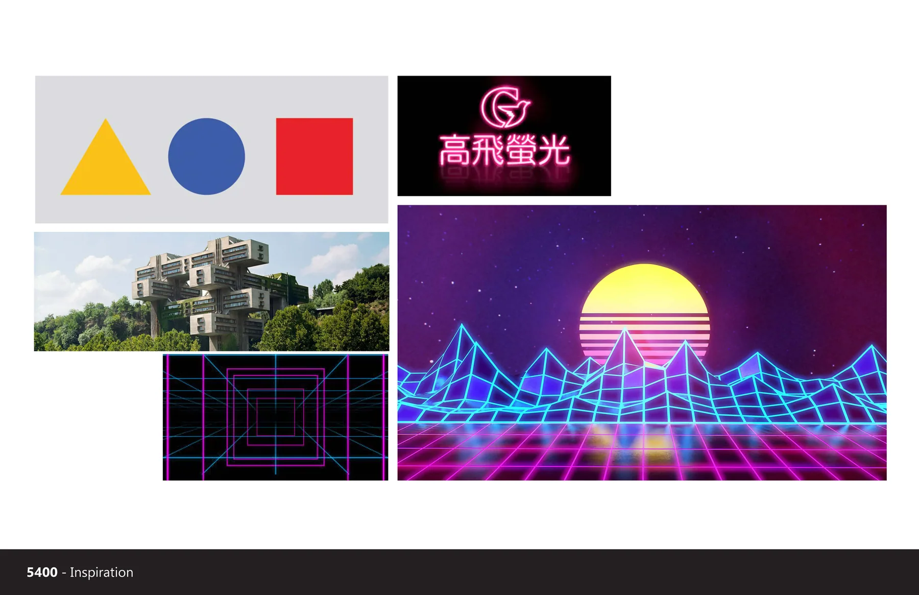
Reference board of geometric forms and retro digital graphics
Graphic references tested a more playful visual language.
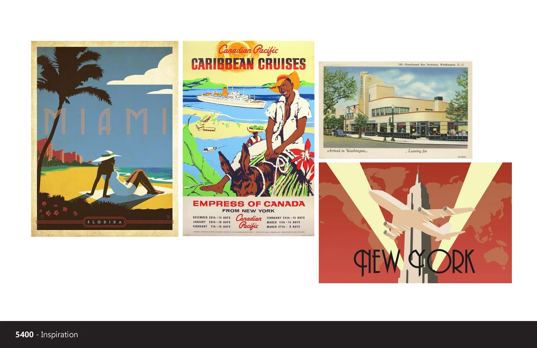
Reference board of vintage Miami posters, architecture, and travel graphics
Miami references gave the exploration a sense of place.
Four sans serif treatments of the number 5400 compared side by side
The early study tested how much personality the numerals could carry.
Four serif treatments of 5400 showing different proportions and contrast
Serif options brought a more editorial voice into the comparison.
Additional sans serif 5400 wordmark studies
A second round pushed the weight and spacing of the numerals.
Additional serif 5400 wordmark studies
The serif studies tested a more distinct voice without losing clarity.

Let 54 lead

The next round pulled the name apart. I tried 5400, 54 Hundred Media, and more compact arrangements before bringing the expressive 54 into a frame with Hundred beneath it. The number became a shorthand people could recognize quickly, while the word kept the full name present.
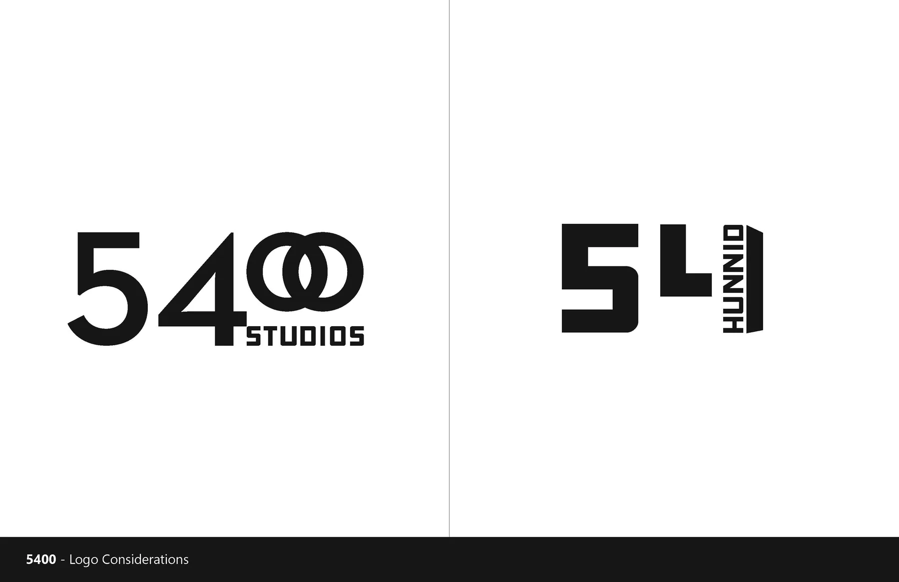
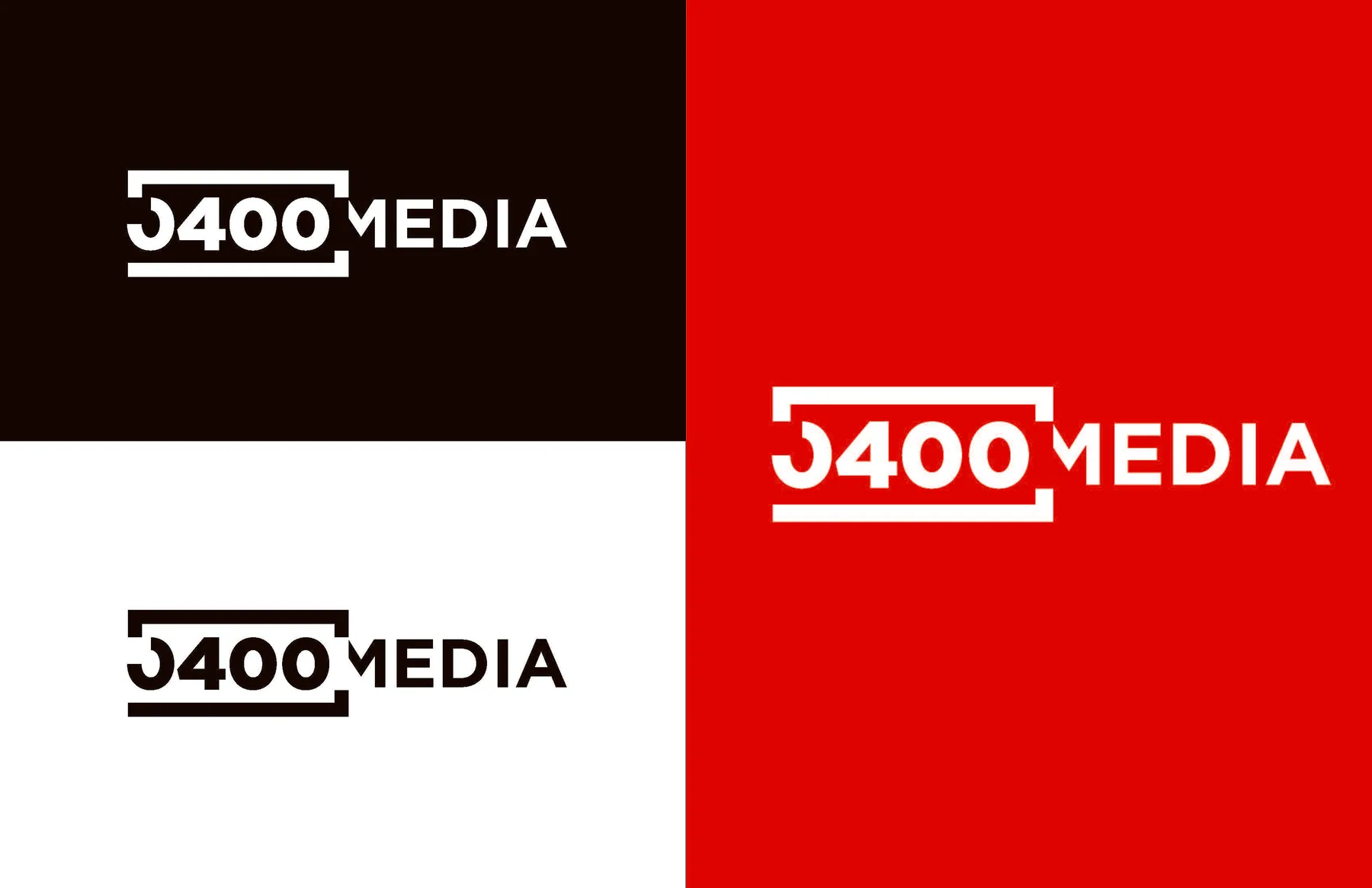
Compact arrangements of the 54 Hundred studio name
Early arrangements tested how tightly the name could be held together.
5400 Media wordmark variations in black, white, and red
The 5400 Media direction made the number more assertive.
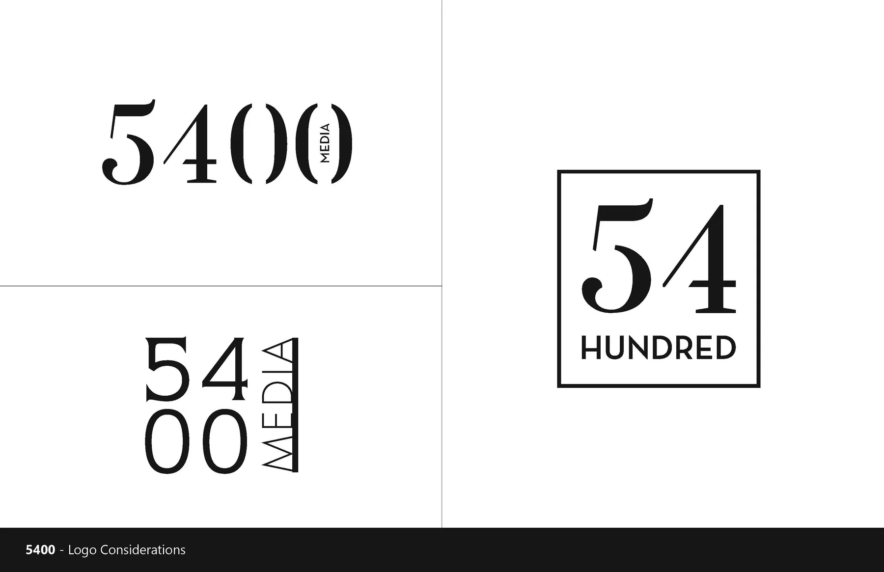
Three logo arrangements exploring 5400 and the framed 54 Hundred mark
Logo explorations, from a full numerical wordmark to the compact framed mark.
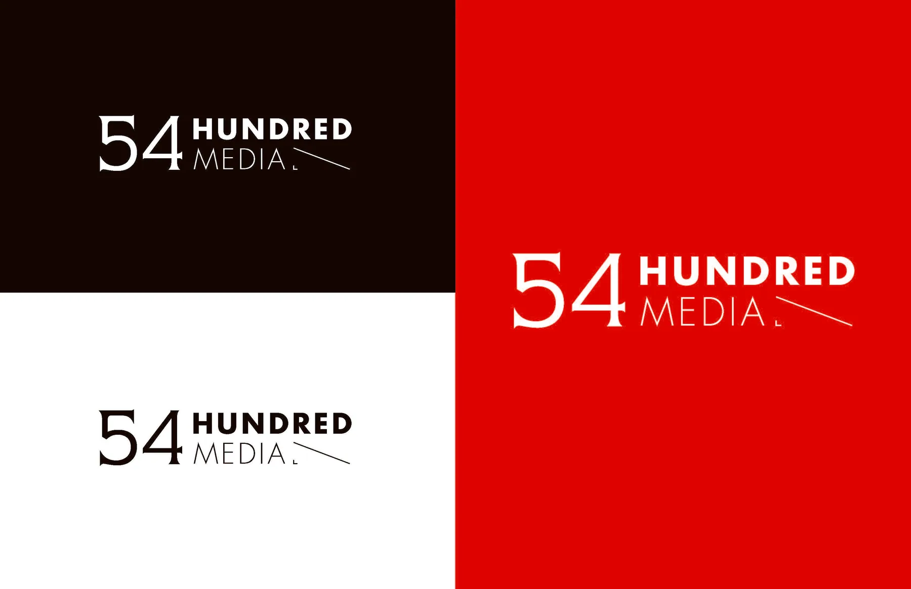
54 Hundred Media logo variants on dark, light, and red fields
The shortened 54 put the most memorable part of the name first.
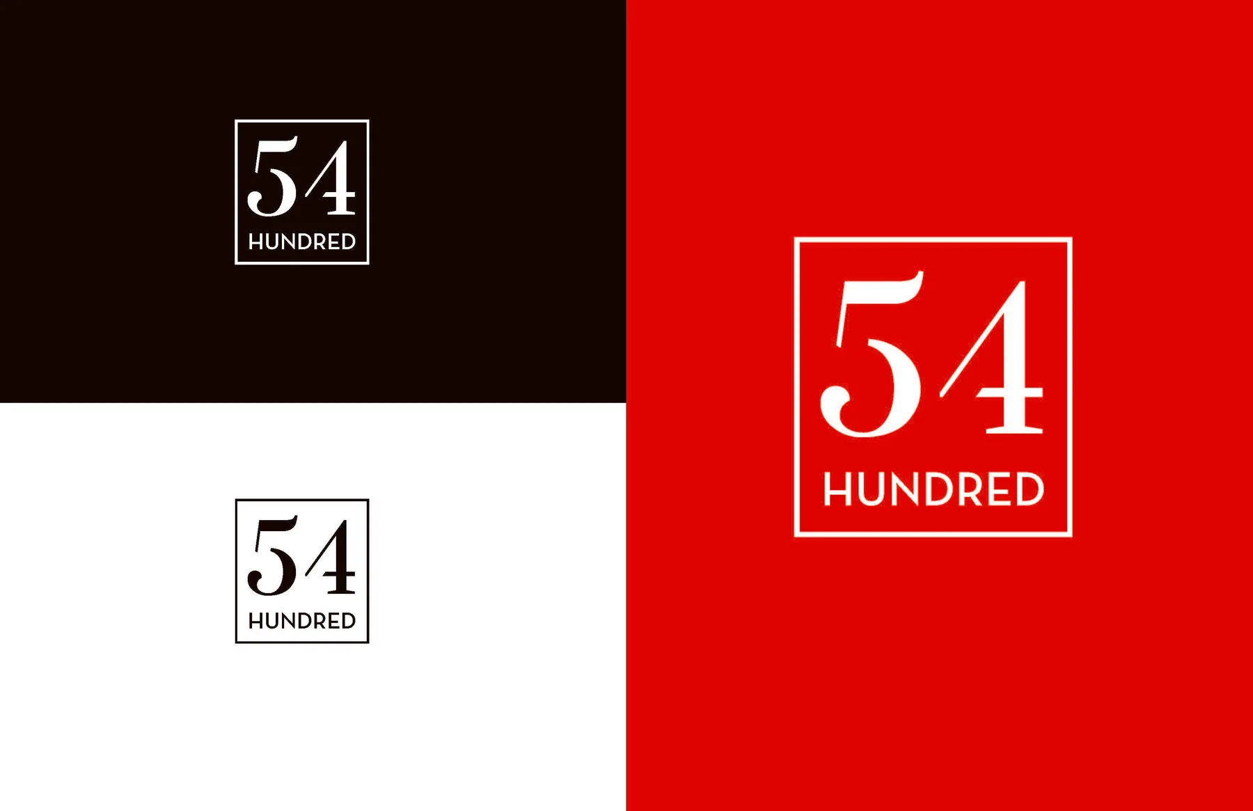
Framed 54 Hundred mark tested on dark, white, and red backgrounds
Color trials checked whether the framed mark would hold together in use.
Final 54 Hundred mark in white against a nearly black background
The selected mark works without an image or a supporting headline.
Framed 54 Hundred mark on a pale background
The same signature in its light setting.

Build in flexibility

The mark begins in black and white. Blush, pale blue, and coral give it other ways to meet photography without redrawing the logo. The Miami image studies provided a sense of place, but the identity did not have to depend on one particular picture to feel like 54 Hundred.
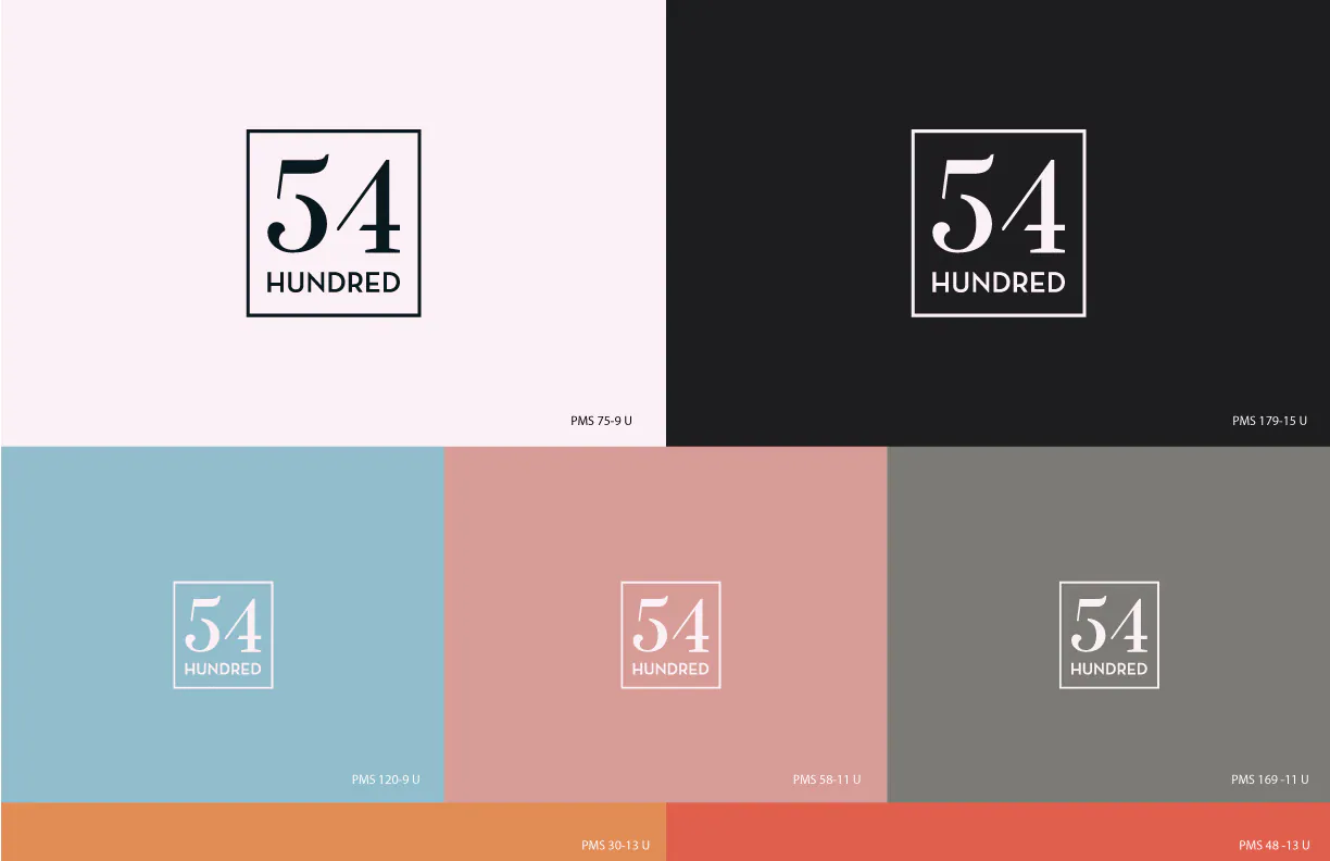
54 Hundred mark shown across blush, charcoal, blue, pink, and gray color fields
The same mark tested across the proposed palette.
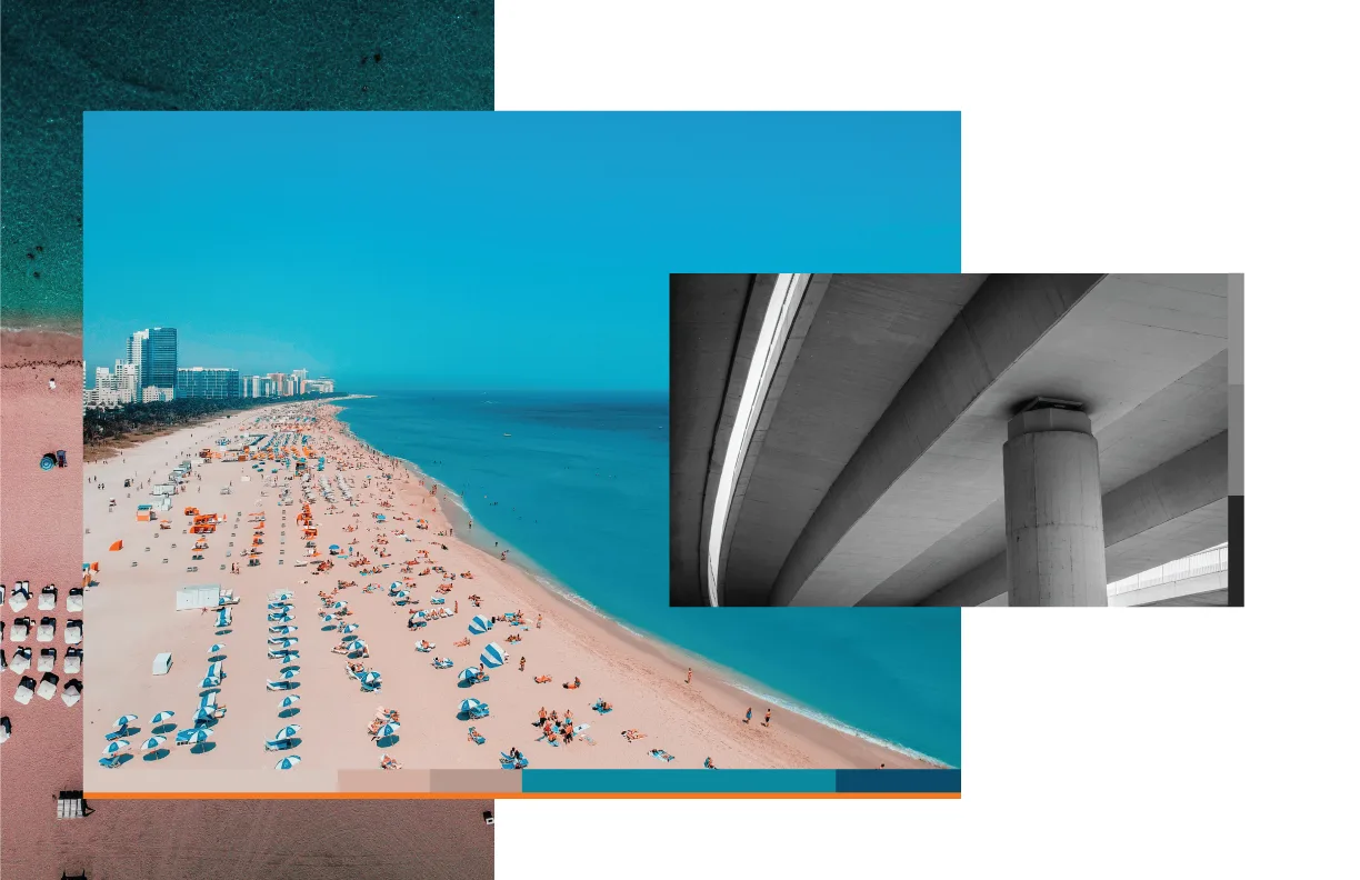
Miami beach and architectural photography used to explore the studio's color direction
Photography gave the colors context without becoming the identity itself.
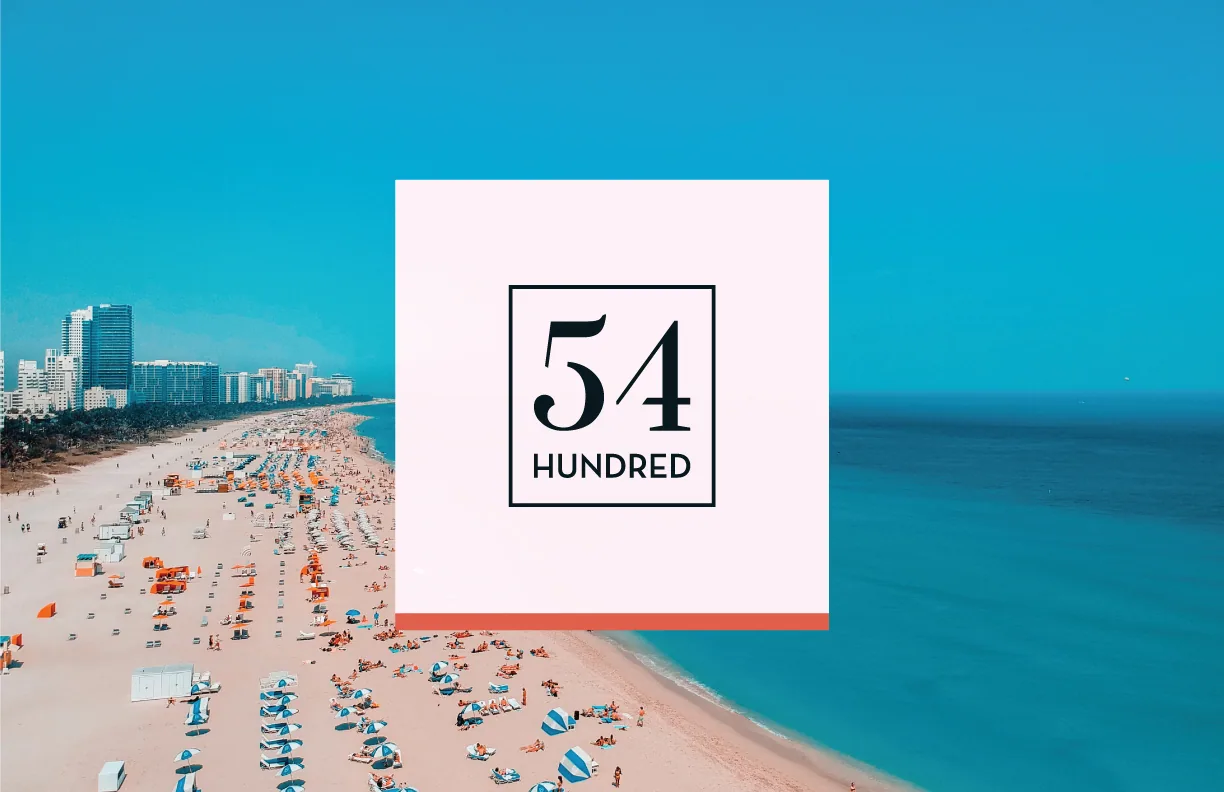
Framed 54 Hundred mark set over an aerial Miami beach image
The mark remains readable over a full color image.
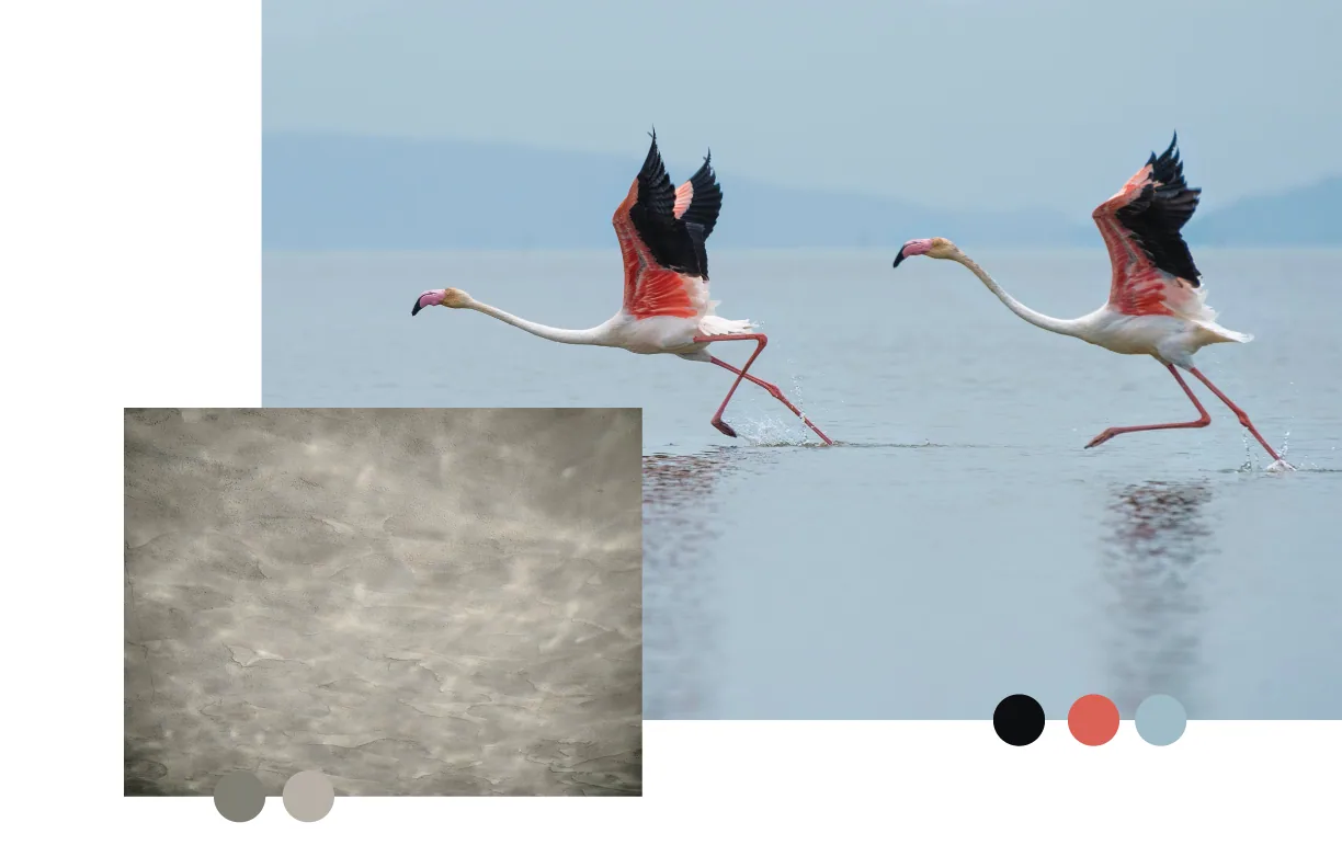
Flamingo photograph paired with concrete texture and palette swatches
A second image study explored a quieter mix of color and texture.

Put it to work

Business cards were the small scale test. The number needed to be immediately visible, but the contact details still had to be easy to find. The print studies gave the mark space and kept the supporting information straightforward.

The card studies

The layouts changed in small ways as I tested what should lead: the mark, the name, or the person's details. Each study below is a different composition from that process.

Coral 54 Hundred card face against a divided pale and charcoal background
01 / Coral mark
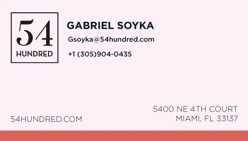
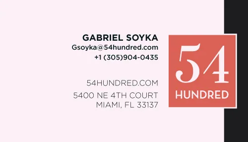
54 Hundred contact card with founder details and a coral mark
02 / Contact layout
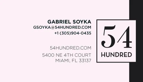
Light business card with the 54 Hundred mark and founder details
03 / Open layout
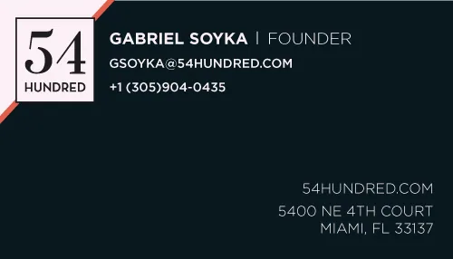
Dark 54 Hundred contact card with a pale logo and diagonal corner accent
04 / Dark contact layout
Coral 54 Hundred mark placed across pale and dark card fields
05 / Split field
Pale card front with a centered outlined 54 Hundred mark
06 / Centered mark
Contact card with a right aligned 54 Hundred mark
07 / Right edge
54 Hundred business card with a blue field and diagonal coral accents
08 / Blue field
54 Hundred mark on a dark and pale card divided by a diagonal line
09 / Diagonal frame
Pale 54 Hundred contact card with coral logo block at right
10 / Logo block
Pale business card with dark 54 Hundred logo and horizontal coral block
11 / Offset block
Business card front with the 54 Hundred mark against pale and dark vertical bands
12 / Vertical bands
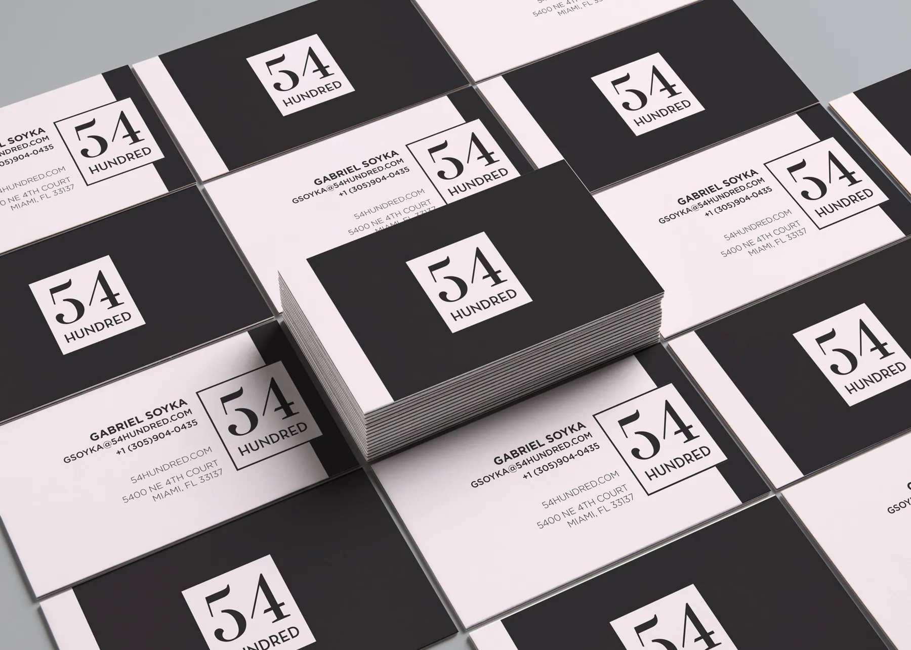
Mockup of black and pale blush 54 Hundred business cards arranged in a grid
Business card concepts test the identity at arm's length.
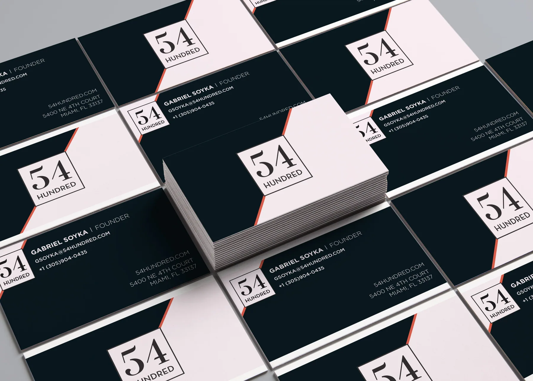
Dark 54 Hundred card mockup with multiple printed cards arranged on a tabletop
A darker print mockup shows how the chosen direction works in a set.

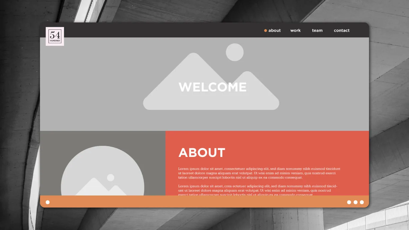
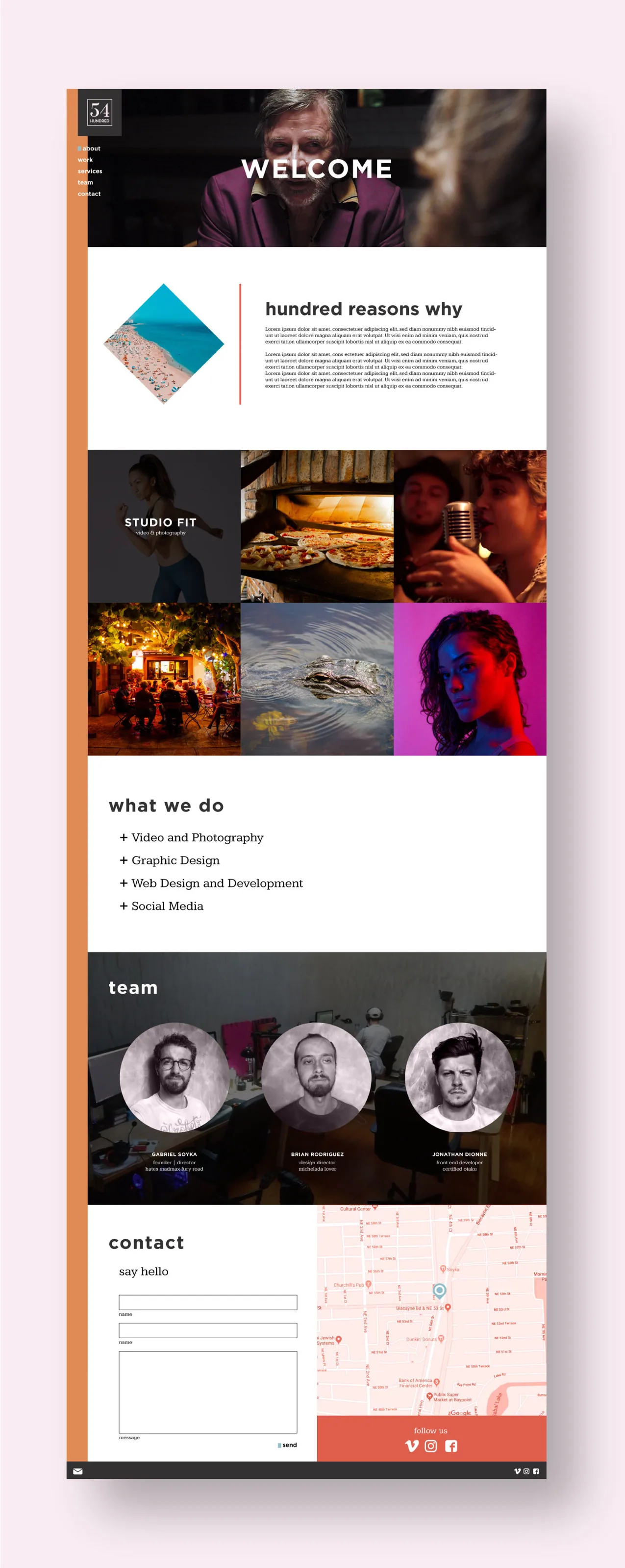
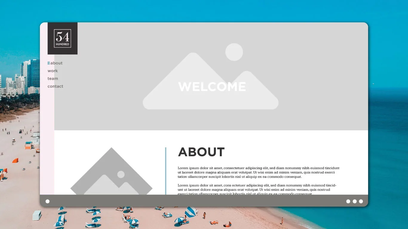
On the website concept, the mark becomes a quiet anchor in the corner. The main space belongs to the studio’s imagery, its services, and the people behind the work. That balance mattered more than repeating the logo at every turn.
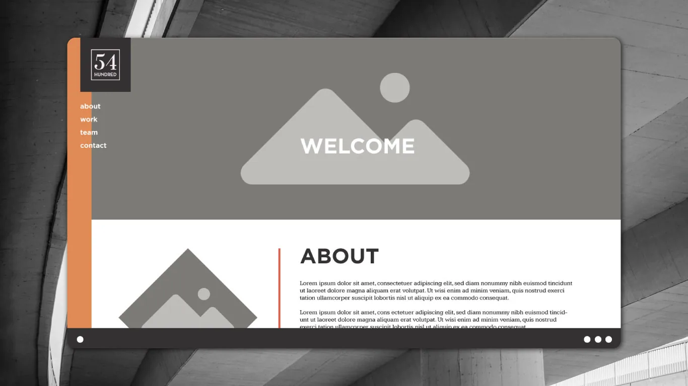
Early gray 54 Hundred website screen concept
An early layout established the page structure.
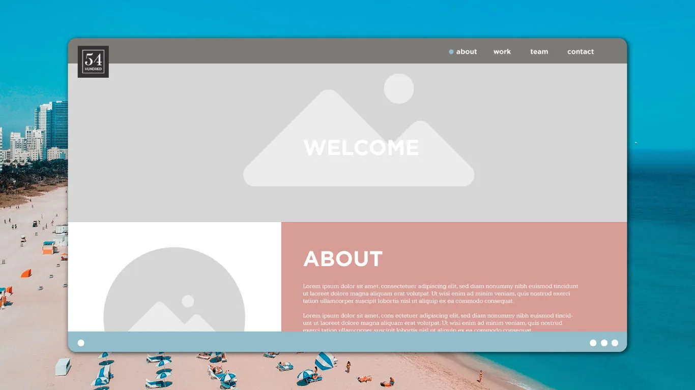
54 Hundred website screen over Miami beach photography with a gray content area
The first photo treatment brought Miami into the interface.
54 Hundred website screen with gray photography and a coral content panel
The coral panel gave the content a stronger presence.
54 Hundred website screen over beach photography with a coral content panel
The final screen study combined the image and color directions.
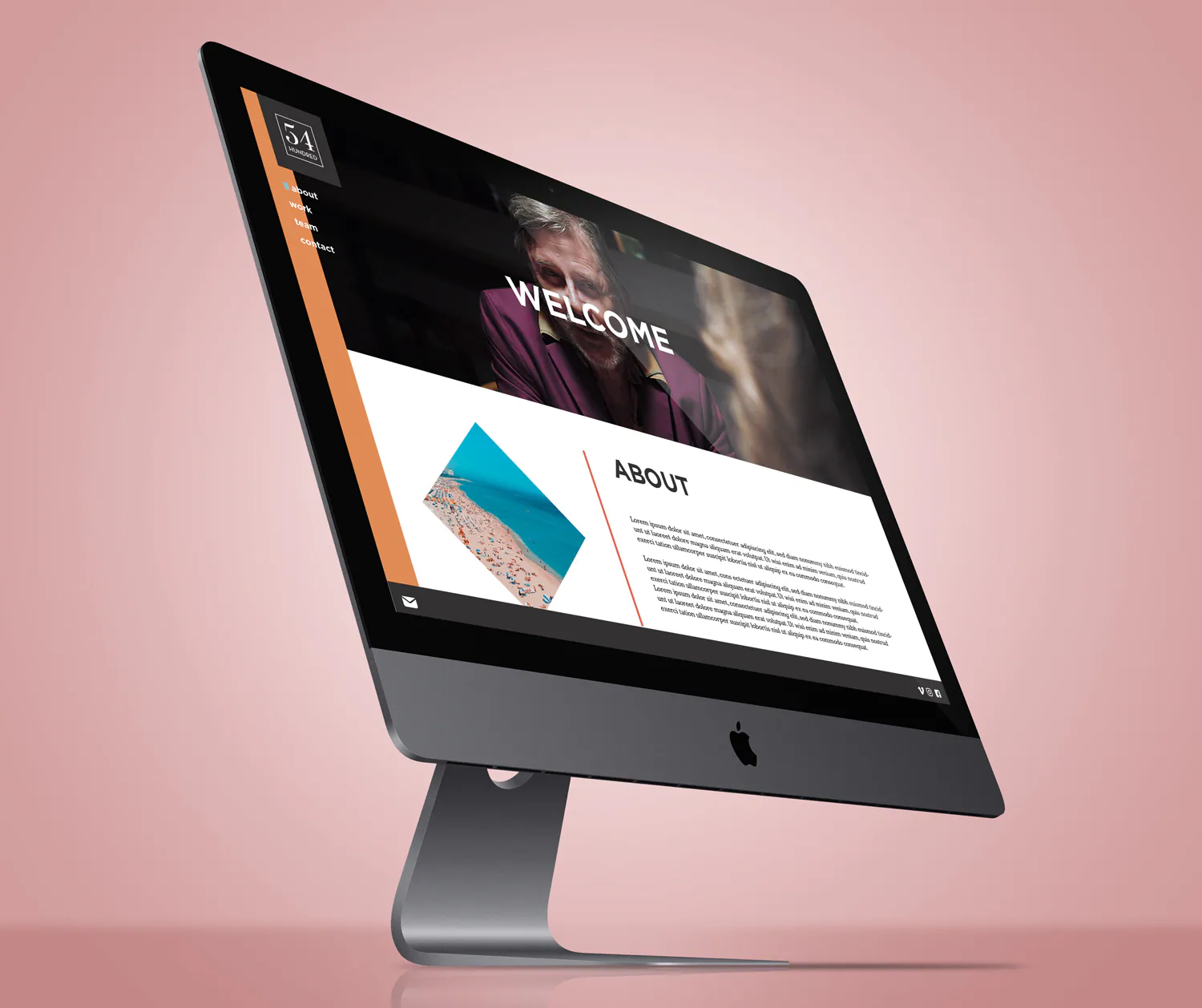
54 Hundred website concept presented on a desktop monitor
The identity acts as an entry point, not the whole page.
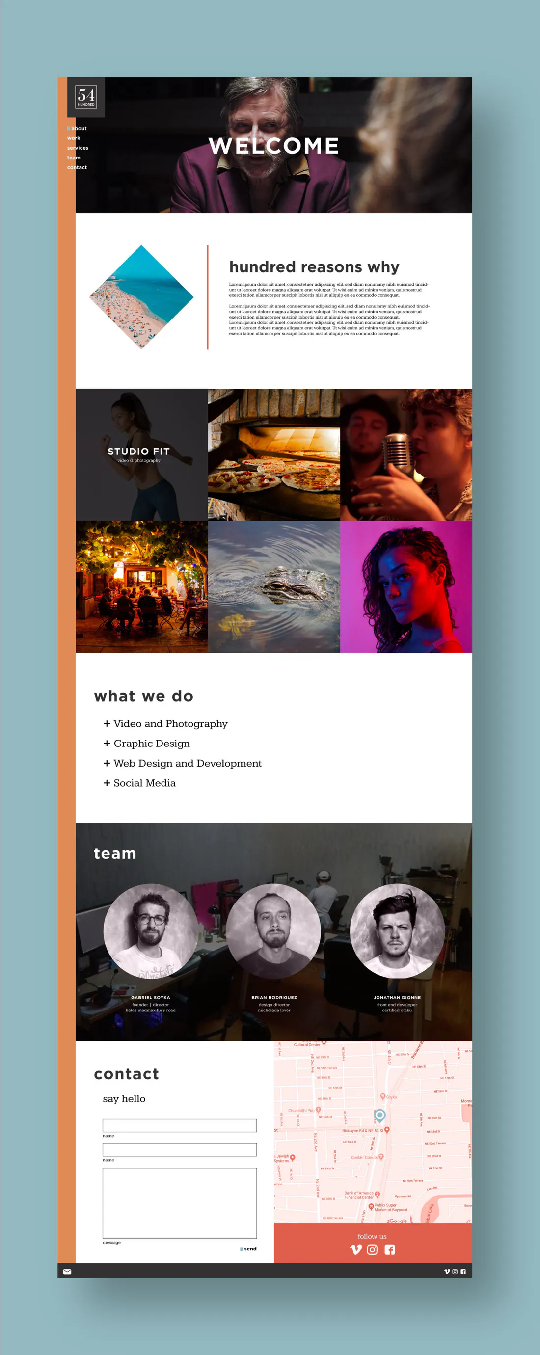
Full page 54 Hundred website concept with work imagery, services, team, and contact sections
The first full page concept.
Alternate full page 54 Hundred website concept with revised service and portfolio sections
A second pass adjusted the page composition.

Test it at a distance

The outdoor mockup asks for the opposite of a business card. It has to register from across a street. I kept the mark contained inside a simple white field and let the Miami beach image provide the setting. The exercise showed how a small, disciplined signature could still hold its place at public scale.
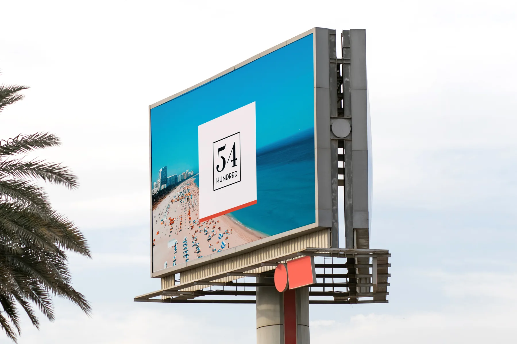
54 Hundred billboard concept above a Miami street with the framed mark over beach photography
Billboard mockup used to test the identity at a distance.

The same mark could introduce someone at arm's length and hold its place on a city street. That was the measure of the system.

Start a conversation

What do you
have in mind?

A few details is enough. I’ll reply by email.

What can I help with?

Choose any that fit. It’s OK if you’re still figuring it out.

Straight to Brian.
No mailing lists.